

.png)
September 15, 2026
12 mins read
Webflow AI UX Evaluation Tools: Complete 2026 Guide

Explore appsrow with AI
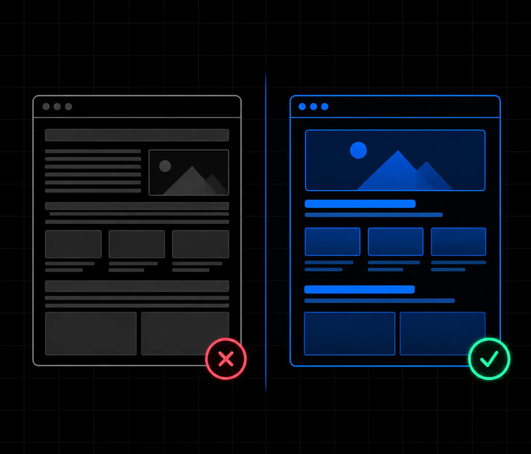
White space, also called negative space, is the empty area between and around elements in a web page that gives content room to breathe and helps users understand the relationship between different elements.
Despite its name, white space does not have to be white. It can be any background color, texture, or visual area where there is no primary content competing for the user’s attention. It can appear between paragraphs, around images, inside buttons, between navigation items, around cards, or between entire sections of a page.
Good use of white space can make a website feel organized, premium, readable, and easy to navigate. Poor use of white space can make the same website feel unfinished, confusing, or unnecessarily long.
The challenge is not simply adding more space. The real challenge is knowing where space is useful, where it becomes excessive, and how much spacing each part of a page actually needs.
This guide explains how white space works in web design, the most common white space problems, how excessive spacing affects user experience, and practical ways to fix spacing issues with HTML and CSS.
White space in web design is the intentional or unintentional empty space surrounding content and interface elements.
It can exist between two lines of text, between a heading and paragraph, around an image, between cards, or between major sections of a website.
White space is not necessarily wasted space. In many cases, it is an important design tool that separates related and unrelated information.
For example, consider a page with a heading, paragraph, and call-to-action button. If all three elements are placed directly next to each other with almost no spacing, the content can become difficult to scan.
Adding controlled spacing creates visual relationships.
A heading with a small gap before its paragraph tells the visitor that the two elements belong together. A larger gap before the next section tells the visitor that a new topic is beginning.
This is why spacing should be treated as part of the interface rather than something added at the end of the design process.
White space is important because it improves readability, visual hierarchy, usability, focus, and the overall perception of a website.
A page containing many elements can quickly become overwhelming. White space gives users visual pauses and allows them to process information in smaller groups.
A well-structured page often uses different spacing levels for different relationships.
For example:
Effective website design principles rely on this type of visual organization to make pages easier to understand.
The goal is not to make a website look empty. The goal is to make every element easier to understand.
Visual hierarchy is the arrangement of design elements so users can quickly understand what is most important, what belongs together, and what they should look at next.
White space plays an important role in creating this hierarchy.
Imagine a landing page containing:
If every element has identical spacing, the page can feel flat.
Instead, spacing can establish importance.
The headline might have generous space around it to create focus. The paragraph may sit relatively close to the headline because the two elements are related. The CTA can sit slightly farther away to create a clear action point.
The next section can then have substantially more space separating it from the hero area.
This creates a visual rhythm that helps visitors understand the page without consciously analyzing its structure.
Macro white space refers to large areas of space between major page elements, while micro white space refers to smaller spacing between individual elements within a component.
Macro white space can appear:
For example:
.section {
  padding: 96px 0;
}
This creates space around an entire section.
Micro white space appears inside smaller components.
Examples include:
For example:
.card h3 {
  margin-bottom: 16px;
}
.card p {
  margin-bottom: 20px;
}
Good design requires both macro and micro spacing to work together.
Readability is the ease with which users can visually process and understand written content, and appropriate white space directly influences it.
A paragraph that stretches across the entire screen can be difficult to read, even when the typography itself is technically correct.
A narrower content area creates shorter line lengths and makes reading more comfortable.
For example:
article {
  max-width: 760px;
  margin: 0 auto;
}
However, making the content area too narrow can also create problems.
If a desktop article is restricted to only 450 or 500 pixels when the surrounding layout has plenty of available space, the page can feel unnecessarily sparse.
The correct approach is to balance content width with typography, device size, and the purpose of the page.
Typography and spacing work together because font size, line height, margins, and letter spacing all influence the amount of visual space occupied by text.
A common mistake is to treat typography and spacing as separate design decisions.
Consider:
h1 {
  font-size: 72px;
  line-height: 1.5;
  margin-bottom: 60px;
}
This combination can create excessive vertical space.
A more balanced approach might be:
h1 {
  font-size: 64px;
  line-height: 1.1;
  margin-bottom: 24px;
}
The exact values will depend on the design, but the principle remains the same.
Large typography does not automatically require enormous spacing.
Spacing should support the hierarchy rather than exaggerate it.
White space becomes excessive when it stops improving clarity and starts creating unnecessary distance, friction, or visual imbalance.
There is no universal number that defines too much white space.
A 100-pixel gap may be appropriate in a hero section but excessive between a heading and its paragraph.
Similarly, 60 pixels between two major sections might be too little for one design and perfectly appropriate for another.
Instead of asking:
How many pixels of white space should I use?
Ask:
Does this amount of space improve the relationship between these elements?
If removing some space makes the content easier to understand without making the page feel crowded, the original spacing was probably excessive.
Excessive section padding occurs when a section contains large amounts of vertical space that do not contribute to hierarchy, readability, or visual balance.
For example:
<section class="hero">
  <h1>Build a Better Digital Experience</h1>
  <p>Create a website that is easier to use and easier to understand.</p>
  <a href="#">Get Started</a>
</section>

.hero {
  padding: 200px 40px;
}
A 200-pixel top and bottom padding may be appropriate for a highly visual hero, but it can make a simple content section unnecessarily tall.
A more balanced starting point could be:
.hero {
  padding: 100px 40px;
}
The correct value should depend on the content and surrounding sections.
Large margins between related elements can visually disconnect content that users should perceive as a single group.
For example:
<div class="content">
  <h2>Why Choose Us?</h2>
  <p>We help businesses create better digital experiences.</p>
  <a href="#">Learn More</a>
</div>

.content h2 {
  margin-bottom: 60px;
}

.content p {
  margin-bottom: 60px;
}
The heading and paragraph are closely related, so 60 pixels between them may weaken their visual relationship.
A better approach could be:
.content h2 {
  margin-bottom: 20px;
}
.content p {
  margin-bottom: 24px;
}
The spacing should communicate that the heading, paragraph, and CTA are part of the same content group.
Fixed heights can create unnecessary white space when the amount of content inside a component changes.
For example:
.hero {
  height: 900px;
}
If the hero only contains a short heading, paragraph, and button, a 900-pixel height may leave a large unused area.
Instead, consider:
.hero {
  min-height: 500px;
  height: auto;
}
Or use padding:
.hero {
   padding: 100px 40px;
}
Flexible layouts generally adapt better to different content lengths and screen sizes.
An unnecessarily large min-height can force a section to remain much taller than its content requires.
For example:
.feature-section {
   min-height: 1000px;
}
If the content only needs approximately 500 to 600 pixels, the remaining area becomes artificial white space.
A better approach could be:
.feature-section {
   min-height: 600px;
}
Or:
.feature-section {
   min-height: auto;
}
Use minimum heights when they serve a real layout purpose, not simply because a section looks better at a particular height during the initial design.
Flexbox gap controls the space between items, and an oversized gap can make related components appear unnecessarily disconnected.
For example:
.cards {
   display: flex;
   gap: 100px;
}
If three cards are displayed across a normal desktop layout, 100 pixels between each card may consume valuable horizontal space.
A more practical starting point might be:
.cards {
   display: flex;
   gap: 32px;
}
Responsive spacing can also be used:
.cards {
   display: flex;
   gap: clamp(20px, 4vw, 48px);
}
This allows the gap to scale with the available viewport.
Large CSS Grid gaps can create visual separation that is greater than the relationship between the grid items requires.
For example:
.grid {
   display: grid;
   grid-template-columns: repeat(3, 1fr);
   gap: 80px;
}
A smaller gap may create a more connected layout:
grid {
   display: grid;
   grid-template-columns: repeat(3, 1fr);
   gap: 32px;
}
Grid spacing should consider both the card width and the amount of content inside each card.
A content container that is unnecessarily narrow can make a website appear to have excessive white space even when the section padding is reasonable.
For example:
.article {
   max-width: 600px;
   margin: 0 auto;
}
For some long-form content, increasing the width can improve balance:
.article {
   max-width: 760px;
   margin: 0 auto;
}
This does not mean wider is always better.
Very wide text blocks can reduce readability, while extremely narrow blocks can make a page feel empty.
The right width depends on the content type.
Incorrect line height, font size, or heading margins can create the appearance of a white space problem even when the actual layout spacing is reasonable.
For example:
h1 {
   font-size: 72px;
   line-height: 1.5;
   margin-bottom: 60px;
}
The line height alone creates significant vertical space.
A more controlled approach:
h1 {
   font-size: 64px;
   line-height: 1.1;
   margin-bottom: 24px;
}
Typography should be evaluated as part of the entire component rather than independently.
Spacer elements are empty HTML elements used only to create visual distance, and excessive reliance on them can make layouts difficult to maintain.
For example:
<section>

  <h2>Our Services</h2>
  <div class="spacer"></div>
  <p>Explore our digital services.</p>

</section>

.spacer {
  height: 100px;
}
A cleaner approach is to use spacing directly on the relevant element:
<section >  <h2 > Our Services</h2 >  <p > Explore our digital services.</p > </section > h2 {
   margin-bottom: 24px;
}
This makes the relationship between content and spacing much easier to understand.
Some hidden elements can continue affecting layout depending on the CSS property used to hide them.
For example:
.mobile-menu {
   visibility: hidden;
}
The element remains part of the layout even though it is not visible.
When appropriate, use:
.mobile-menu {
  display: none;
}
The correct hiding technique depends on the desired behavior, but developers should always check whether invisible elements are still consuming space.
Absolute positioning can produce unexpected layouts when elements are manually positioned instead of participating naturally in the page flow.
For example:
.image {
   position: absolute;
   top: 200px;
}
Large offsets can make the layout appear disconnected or create awkward gaps at different screen sizes.
When possible, use Flexbox or Grid to establish the relationship between content and visuals:
.hero {
   display: grid;
   grid-template-columns: 1fr 1fr;
   align-items: center;
   gap: 40px;
}
This creates a more predictable relationship between the two columns.
Desktop spacing values should not automatically be carried over to mobile because smaller screens require tighter and more deliberate spacing.
For example:
.section {
   padding: 120px 40px;
}
On a mobile device, this can consume a significant portion of the viewport.
A responsive approach:
.section {
  padding: 120px 40px;
}

@media (max-width: 767px) {
  .section {
    padding: 64px 20px;
  }
}
Responsive design should not simply shrink the desktop layout. It should reconsider spacing based on the available screen area.
Images need enough surrounding space to remain visually distinct, but excessive margins can separate them from the content they support.
For example:
.image {
   margin: 100px 0;
}
If the image is directly related to the paragraph above and below it, this much spacing may break the visual connection.
A more balanced approach:
.image {
   margin: 48px 0;
}
The correct value depends on the size and purpose of the image.
Navigation spacing should make individual links easy to identify without making the navigation appear fragmented.
For example:
nav {
   display: flex;
   gap: 60px;
}
A smaller gap can create a stronger navigation group:
nav {
   display: flex;
   gap: 24px;
}
Navigation should be easy to scan as one system.
Too little space can make links difficult to distinguish, while too much space can make them appear unrelated.
Inconsistent spacing occurs when visually similar sections use dramatically different padding and margins without a clear design reason.
For example:
.section-one {
   padding: 80px 0;
}
.section-two {
   padding: 140px 0;
}
.section-three {
   padding: 65px 0;
}
This can create an inconsistent visual rhythm.
A spacing system makes the design easier to manage:
:root {
   --space-sm: 16px;
   --space-md: 32px;
   --space-lg: 64px;
   --space-xl: 96px;
}
.section {
   padding: var(--space-xl) 0;
}
For responsive designs:
.section {
   padding-top: clamp(48px, 8vw, 96px);
   padding-bottom: clamp(48px, 8vw, 96px);
}
A consistent spacing system does not mean every section must have identical spacing. It means spacing decisions should follow a recognizable design logic.
Mobile design requires a different approach to white space because the viewport is smaller and excessive spacing can push important content too far below the fold.
On desktop, a large hero section may feel elegant because the screen provides enough room for content and visual elements.
On mobile, the same spacing can cause a user to scroll significantly before reaching the primary action.
Mobile spacing should therefore consider:
This is particularly important for conversion-focused pages.
A visitor should not have to scroll through large empty areas simply to find the next meaningful piece of information.
Responsive white space means adapting spacing values according to screen size, content density, and layout changes.
A desktop design may use:
.section {
   padding: 96px 48px;
}
Tablet spacing could be: .section {
   padding: 72px 32px;
}
Mobile spacing could be: .section {
   padding: 56px 20px;
}
Modern CSS functions such as clamp() can make this process more flexible:
.section {
   padding: clamp(48px, 8vw, 96px) 20px;
}
This prevents the design from jumping between completely different spacing values at every breakpoint.
Navigation requires controlled spacing because the goal is to make options easy to identify while maintaining a clear relationship between them.
Navigation should not feel crowded.
At the same time, excessive spacing can make a navigation bar feel disconnected.
The design should also account for mobile navigation, where horizontal space becomes limited.
On smaller screens, navigation may transition into a menu, drawer, or other compact interface.
The important principle is consistency.
Similar navigation items should have similar spacing, and primary actions should have enough separation to remain recognizable.
Form spacing should help users understand which labels, inputs, instructions, and validation messages belong together.
Consider a form with:
If every field has 50 or 60 pixels of vertical spacing, the form can become unnecessarily long.
Instead, related elements can be grouped more closely.
For example:
.form-group {
   margin-bottom: 24px;
}
.form-label {
   margin-bottom: 8px;
}
This creates a clear relationship between the label and input while maintaining separation between different fields.
Error messages and help text should also appear close to the field they describe.
Strategic white space can increase the visual prominence of a call-to-action by separating it from competing elements.
A CTA does not always need a larger button.
Sometimes it simply needs better surrounding space.
For example:
.cta {
   margin-top: 32px;
}
The space above the CTA separates it from supporting content.
However, excessive space can make the CTA look disconnected.
The objective is to create enough visual separation to establish importance while keeping the CTA connected to the message that supports it.
White space can influence conversion by reducing distraction and directing attention toward important actions.
A conversion-focused page often contains several competing elements:
If everything is visually prominent, nothing is truly prominent.
White space can help establish priority.
For example, a primary CTA may receive more surrounding space than secondary links. A pricing section may be separated clearly from supporting content. A testimonial can have enough space around it to make the customer’s statement easier to notice.
This does not mean adding large gaps everywhere.
Conversion-focused design is about controlling attention.
Most white space problems come from treating spacing as decoration rather than as part of the information architecture.
Some common mistakes include:
Every component does not need identical margins.
Large sections can create a premium appearance, but excessive height can make the page unnecessarily long.
Desktop spacing often becomes excessive on smaller screens.
Spacer elements can make layouts harder to maintain.
Large headlines combined with generous line height and margins can consume too much space.
Narrow content can make a page appear emptier than necessary.
Related elements should generally be closer together than unrelated elements.
Random spacing values make a website feel inconsistent.
Effective white space comes from intentionally controlling relationships between elements rather than simply increasing the amount of empty space.
A practical approach is to start with a spacing scale.
For example:
:root {
   --space-xs: 8px;
   --space-sm: 16px;
   --space-md: 24px;
   --space-lg: 32px;
   --space-xl: 48px;
   --space-2xl: 64px;
   --space-3xl: 96px;
}
You can then use these values consistently:
.card {
   padding: var(--space-lg);
}
.card h3 {
   margin-bottom: var(--space-sm);
}
.section {
   padding: var(--space-3xl) 0;
}
This makes the design easier to maintain and helps establish a predictable visual rhythm.
The distance between elements should communicate how closely those elements are related.
A simple rule is:
Related elements should generally be closer together than unrelated elements.
For example:
Heading
↓ small gap
Paragraph
↓ small gap
Button
↓ larger gap
Next section
This is more effective than using the same 40-pixel gap between every element.
The spacing itself becomes part of the communication system.
Spacing can influence how users perceive a brand because generous, controlled layouts often communicate a different personality from dense, information-heavy layouts.
Luxury brands may use substantial white space to create a feeling of exclusivity.
Technology companies may use clean spacing to communicate simplicity.
Editorial websites may use carefully controlled margins and line lengths to prioritize reading.
E-commerce websites often need tighter layouts because users must compare products, prices, specifications, and actions.
There is no universally correct amount of white space.
The appropriate amount depends partly on the brand and the user’s expectations.
Corporate websites often benefit from structured spacing that makes complex information easier to scan.
Large section gaps can work well when transitioning between major topics, but excessive spacing can make the site feel unnecessarily long.
SaaS websites typically combine product screenshots, feature sections, benefits, pricing, testimonials, and CTAs.
White space helps establish hierarchy between these components.
E-commerce sites generally require more information density.
Product grids, filters, prices, reviews, product specifications, and purchase actions all need to fit into a usable interface.
Too much white space can reduce the number of products users can compare at once.
Portfolio websites can often use more generous white space because visual presentation is a central part of the experience.
Large images and projects can benefit from breathing room.
Editorial websites need to prioritize reading comfort.
Line length, paragraph spacing, typography, and margins become especially important.
White space may look empty, but it performs a functional role in the design.
It separates information.
It creates hierarchy.
It controls attention.
It improves readability.
It creates rhythm.
It makes interfaces easier to scan.
The problem begins when empty space exists without a meaningful purpose.
A large gap between two unrelated sections can be useful.
A large gap between a heading and the paragraph that explains it may not be.
This distinction is important.
Good white space is intentional.
Bad white space is usually accidental, excessive, inconsistent, or caused by a technical layout problem.
A white space audit involves examining spacing throughout a website to identify areas where empty space improves the experience and areas where it creates unnecessary friction.
Start by reviewing the page from top to bottom.
Look for:
Then ask three questions:
Does the space have a purpose?
If you cannot explain why the space exists, investigate it.
Does the space communicate hierarchy?
The spacing should help users understand relationships between elements.
Does the space improve the user experience?
If removing some space makes the page easier to scan without making it crowded, reduce it.
Use this checklist when reviewing a website:
If several answers indicate a problem, the website may have a spacing issue rather than a content issue.
White space should never be considered in isolation because spacing interacts with layout, typography, imagery, navigation, content, and user behavior.
A strong website design system establishes relationships between all of these elements.
For example, a design team may define:
These decisions work together to create consistency.
A website can have attractive individual sections and still feel inconsistent if each section uses a completely different spacing system.
A structured approach to website design and development helps prevent these inconsistencies.
How to Decide Whether You Need More or Less White Space
The right amount of white space is the amount that makes content relationships clear without creating unnecessary visual distance.
If the page feels crowded, consider whether additional space can improve hierarchy.
If the page feels empty, look for spacing that does not have a clear purpose.
If users struggle to understand which elements belong together, reduce the space between related elements.
If different sections blend together, increase the separation between them.
If the mobile page requires excessive scrolling, reconsider large desktop spacing values.
This approach is more useful than following arbitrary spacing rules.
White space is one of the simplest but most powerful tools in web design because it controls how users perceive relationships, hierarchy, readability, and focus.
The goal is not to maximize white space.
The goal is to use it intentionally.
Too little space can make a website feel crowded and difficult to scan. Too much space can make a website feel disconnected, unfinished, or unnecessarily long.
The best designs find a balance.
Use smaller spacing to connect related elements. Use larger spacing to separate major ideas. Build a consistent spacing system. Review layouts across different screen sizes. Pay attention to typography, container widths, grids, and component structure.
Most importantly, do not judge white space only by how the design looks in a desktop mockup.
Judge it by how easily a real person can understand and navigate the page.
A useful website design approach treats every pixel of space as part of the user experience.
If your website isn't easy to understand, you're giving away opportunities
before the conversation even starts.
Get a free review of how your website appears to AI-powered search and discovery tools.
GOT QUESTIONS ?
What is white space in web design?
White space is the empty area between and around elements on a website. It can appear between text, images, buttons, cards, navigation items, and page sections. Its purpose is to improve hierarchy, readability, organization, and usability.
Is too much white space bad for a website?
Too much white space can be a problem when it creates unnecessary distance between related content or makes important information difficult to reach. However, generous spacing can be completely appropriate when it supports hierarchy, branding, or visual focus.
What is the difference betwe en white space and negative space?
In web design, white space and negative space generally refer to the same concept. Both describe areas without primary content that help separate and organize visual elements. The space does not have to be white.
How can I reduce excessive white space on a website?
Start by checking section padding, margins, fixed heights, minimum heights, grid gaps, Flexbox gaps, typography, content widths, and responsive styles. Look for spacing that does not serve a clear purpose and reduce it carefully rather than removing all empty space.
Does white space affect website usability?
Yes, white space can significantly affect usability because it influences readability, visual hierarchy, scanning, navigation, and the user’s ability to understand relationships between elements. Effective spacing makes a page easier to process, while poorly controlled spacing can create confusion or unnecessary scrolling.

Parth Parmar is a Webflow Expert and Co-Founder & CTO at Appsrow Solutions. He has delivered 300+ Webflow projects for 25+ global B2B brands, helping SaaS companies, AI startups, and tech businesses build conversion-focused websites with scalable CMS, AEO-ready architecture, and measurable growth.