

.png)
October 2, 2026
12 mins read
Webflow Algolia Search and Sync App: What You Need to Know

Explore appsrow with AI
If you build websites in Webflow for clients, you already know the tension that sits at the center of every shared Component Library: the same library has to work for two very different audiences. On one side are Designers and Developers who need full access to every component, variant, and nested element to build and maintain a site properly. On the other side are Marketers, content editors, and clients who just need to drop a handful of approved components onto a page without breaking anything or getting lost in options that don't apply to them.
Webflow's new component visibility controls solve this problem directly. Designers can now hide specific components from the Marketer role inside a shared Component Library, so the Add panel in Build mode only shows what a non-technical teammate actually needs. It's a small feature with an outsized impact on how agencies hand off sites, train clients, and keep design systems clean over time. Below, we'll walk through what the feature does, how to use it well, and how to build it into your own workflow if you manage Webflow sites for clients.
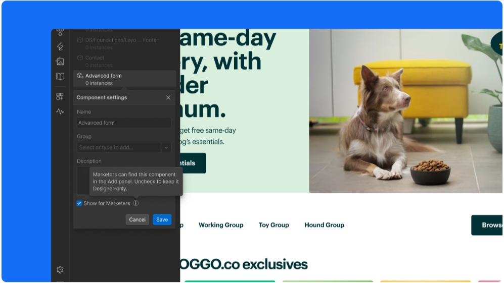
Every agency that has scaled past a handful of Webflow projects knows this story. A component library starts clean: a Hero, a Card, a Navbar, a Footer. Six months later, that same library has forty components, including highly specialized ones like "Pricing Table: Enterprise Variant" or "Blog CTA: Q3 Campaign," built for a single page or a single campaign and never meant to be reused by anyone outside the design team. You can see this pattern across almost every project in our portfolio. The libraries that scale well are the ones where visibility was managed intentionally from day one, not bolted on after the fact.
For Designers and Developers, this sprawl is manageable because they understand the system and know which components are safe to touch. For Marketers and clients working in Build mode, it's a different story. They open the Add panel expecting a short, curated list of blocks they're allowed to use, and instead they're met with dozens of options, many of which are half-finished, deprecated, or simply irrelevant to their day-to-day editing. That confusion leads to broken layouts, support tickets, and a general erosion of trust in the system your team built.
This is exactly the kind of friction that shows up in client feedback. "I don't know which of these to use." "I accidentally used the wrong header component and now it looks off." "Can you just lock this down so I can't mess it up?" If any of that sounds familiar, component visibility controls are the fix.
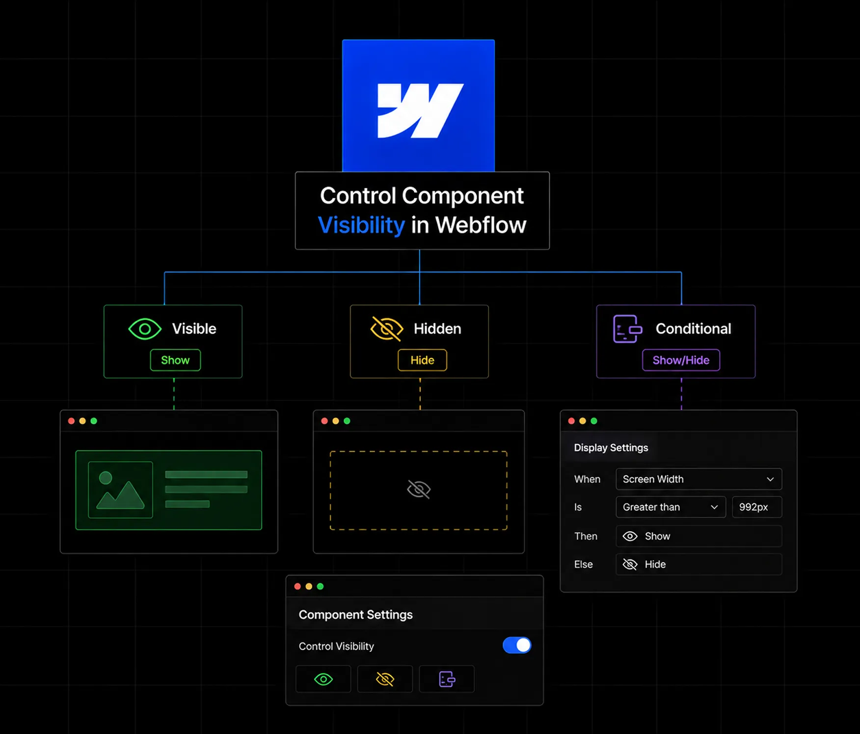
The new capability gives Designers a simple toggle on each component: visible or hidden for the Marketer role. When a component is hidden, it disappears entirely from the Add panel for anyone working in Build mode under that role. It still exists in the underlying library, it can still be edited and maintained by Designers and Developers, and nothing about the live site changes. The only thing that changes is what a Marketer sees when they go looking for something to drop onto a page.
This matters because it separates two things that used to be tangled together: the size of your component library and the size of what a client sees. You can build as robust and specialized a system as your project actually needs, without worrying that complexity will leak into the hands of someone who isn't equipped to manage it.
A few behavioral details worth knowing before you start toggling visibility across a project:
Visibility settings persist across the shared library. Once you hide a component, that setting travels with the library wherever it's shared, so you don't have to re-configure visibility separately for every site the library is connected to. Set it once at the source and it applies consistently downstream.
Hidden components are still fully functional. Hiding a component from Marketers doesn't disable it, delete it, or restrict it from Designers and Developers. It only affects what shows up in the Add panel for that specific role. Anything already placed on a page using that component continues to render and function exactly as before.
Groups can be hidden in bulk. If you organize your library into component groups (which, if you're managing more than a dozen components, you should be), you can hide an entire group in one action rather than toggling each component individually. This is especially useful for grouping together internal-only utility components, legacy components you're phasing out (the kind of cleanup work we handle as part of our Webflow migration services), or highly specialized one-off blocks.
If you're managing an existing Webflow project with an already-sprawling component library, here's a practical way to apply this feature without disrupting anything currently in production.
Step one: audit before you hide anything. Go through your Component panel and categorize every component into one of three buckets: core components that any content editor should be able to use, specialized components that only Designers or Developers should touch, and components that are effectively dead weight and should eventually be deleted rather than just hidden. This audit alone tends to surface a surprising amount of clutter that's been quietly accumulating.
Step two: group before you toggle. Rather than hiding components one at a time, organize your library into logical groups first, such as "Marketing Approved," "Developer Only," and "Legacy: Do Not Use." Grouping makes the visibility toggle a bulk action instead of dozens of individual clicks, and it also makes your library easier to navigate for your own team going forward.
Step three: hide, don't delete. For anything that isn't ready to be permanently removed, hide it rather than deleting it. This keeps your options open if a specialized component turns out to be needed again later, without cluttering the experience for Marketers in the meantime.
Step four: test from the Marketer's seat. Before handing a project back to a client, switch into the Marketer role yourself (or have a teammate do it) and open the Add panel exactly as your client would. This is the single best way to catch anything that still feels cluttered or confusing before your client ever sees it. It's a step worth building into your client onboarding and handoff process permanently, not just running once at launch.
Step five: document what's visible and why. A short internal note, even a simple list, explaining which components are client-visible and why helps future team members maintain the system consistently, rather than guessing at the logic behind past decisions.
Consider a mid-sized SaaS client whose marketing team publishes two or three landing pages a month. Before component visibility controls, their shared library had grown to nearly sixty components across a year of campaigns, redesigns, and A/B tests. The marketing team had no reliable way to tell which of those components were safe, current, and on-brand versus which were leftovers from a rebrand two quarters back.
After an audit, the agency grouped the library into three tiers: eight "Marketing Approved" components covering heroes, testimonials, pricing blocks, and CTAs; a "Developer Only" group holding structural and utility components that should never be touched outside the build team; and a "Legacy" group holding everything else, flagged for eventual deletion. Only the first tier stayed visible to the Marketer role. The result was an Add panel that went from sixty options down to eight, and a marketing team that stopped needing to ask "which one am I supposed to use?" on every new page. Fewer support requests came through, campaign pages shipped faster, and the client's confidence in the system, and in the agency maintaining it, visibly improved.
This kind of outcome is exactly why component visibility deserves a permanent spot in your Webflow site maintenance and support plans, rather than being treated as a one-time setup task. The cleanup itself typically takes a fraction of the time everyone expects going in. Most of the effort is in the initial audit and categorization, not the actual toggling, and once the groups exist, maintaining them going forward is a five-minute task each time a new component gets added to the library.
It's also worth noting that this same tiered approach scales well beyond a single client. Agencies that maintain a master component library across multiple projects can apply the same "Marketing Approved," "Developer Only," and "Legacy" structure as a template, adapting only the specific components inside each tier per client. That consistency makes onboarding new team members easier too, since the logic behind what's visible and why doesn't have to be relearned project by project.
It's tempting to file this under "minor quality-of-life update," but for agencies managing multiple client sites, controlling component visibility touches three things that directly affect the bottom line: handoff time, support load, and perceived professionalism.
Handoff time drops because you're no longer walking a client through which of forty components they should or shouldn't touch. You show them the ten that matter, and the conversation is over in minutes instead of an hour-long training session.
Support load drops because clients can't accidentally reach for a component that was never meant for general use. A huge share of "the site looks broken" tickets trace back to a well-meaning marketer using the wrong block for the job. Removing that option from view removes the ticket before it's ever created.
Perceived professionalism goes up because a clean, curated editing experience signals that the system was built with intention. Clients notice the difference between a Webflow build that feels like a polished product and one that feels like a pile of loose parts, even if they can't articulate exactly why.
A few habits worth adopting once visibility controls are part of your workflow, and topics we return to often on our blog's Webflow tips section:
Keep the Marketer-visible set intentionally small. It's easier to reveal a new component later than to walk back confusion after a client has already used the wrong one. Start restrictive and loosen as trust and need develop.
Revisit visibility settings at project milestones, not just at kickoff. Libraries evolve as a site grows, and a component that made sense to hide at launch might need to be surfaced six months later as a client's needs mature, or vice versa.
Pair visibility controls with naming conventions. Even a hidden-from-Marketer component benefits from a clear, consistent name for your own team's sake, especially as your agency's shared libraries get reused across projects.
Treat this as part of your onboarding checklist for new client projects. Building the habit of setting component visibility before a site ever reaches a client's hands, rather than retrofitting it after complaints roll in, saves everyone time.
Component visibility controls are a small feature on paper, but they solve a problem that every Webflow agency runs into eventually: the gap between what a design system needs to be powerful and what a client needs to be usable. By hiding the noise and surfacing only what Marketers actually need, you get to keep building sophisticated, scalable component libraries without sacrificing the simple, confident editing experience your clients expect.
If you're managing Webflow projects for clients and want a second set of eyes on your component library setup, role permissions, or overall Webflow workflow, our team works through exactly this kind of system design every day. Book a free Webflow site audit and we'll show you exactly where your component library needs cleanup, or simply get in touch to talk through your project.
If your website isn't easy to understand, you're giving away opportunities
before the conversation even starts.
Get a free review of how your website appears to AI-powered search and discovery tools.
GOT QUESTIONS ?
What is component visibility in Webflow?
It's a setting that lets anyone with the Designer role hide specific components, or entire component groups, from the Marketer role. Hidden components no longer appear in the Add panel when someone in the Marketer role is working in Build mode, though they remain fully intact for Designers and Developers.
Does hiding a component delete it or affect the live site?
No. Hiding a component only changes what shows up in the Add panel for the Marketer role. The component still exists in the library, can still be edited by Designers and Developers, and any instance already placed on a page keeps rendering exactly as it did before.
Who can control component visibility settings?
Only users with the Designer role can toggle visibility. Marketers and other roles can use whatever components are visible to them but can't change visibility settings themselves.
Can I hide multiple components at once?
Yes. If your components are organized into groups, you can open the group settings and hide the entire group for Marketers in a single action instead of toggling each component individually.
Will hiding a component break pages that already use it?
No. Existing pages built with a now-hidden component continue to function and display normally. The visibility setting only affects what appears as an option going forward, not what's already published.
Does this visibility setting apply across shared component libraries?
Yes. If a component belongs to a shared library, its visibility setting travels with that library to every site it's connected to, so you don't need to reconfigure it project by project.
What roles besides Marketer are affected by this feature?
Currently, this control is specifically for hiding components from the Marketer role. Designer and Developer roles retain full visibility into the complete component library at all times.
Should I hide a component or just delete it?
If there's any chance the component will be reused later, hide it rather than deleting it. Hiding keeps it available to your build team while removing it from the Marketer's view, whereas deleting removes it permanently for everyone.
How do I know which components to hide?
Start by auditing your library and sorting components into groups such as core components any editor can use, specialized components meant only for Designers or Developers, and outdated components you plan to remove. Anything outside the first group is generally a good candidate to hide.
Is this feature useful for freelancers, or only larger agencies?
It's useful at any scale. Even a single freelancer managing one client benefits from a curated Add panel, since it cuts down on client confusion and support questions regardless of how large the component library or team is.

Parth Parmar is a Webflow Expert and Co-Founder & CTO at Appsrow Solutions. He has delivered 300+ Webflow projects for 25+ global B2B brands, helping SaaS companies, AI startups, and tech businesses build conversion-focused websites with scalable CMS, AEO-ready architecture, and measurable growth.
CURATED READING
.png)
.png)